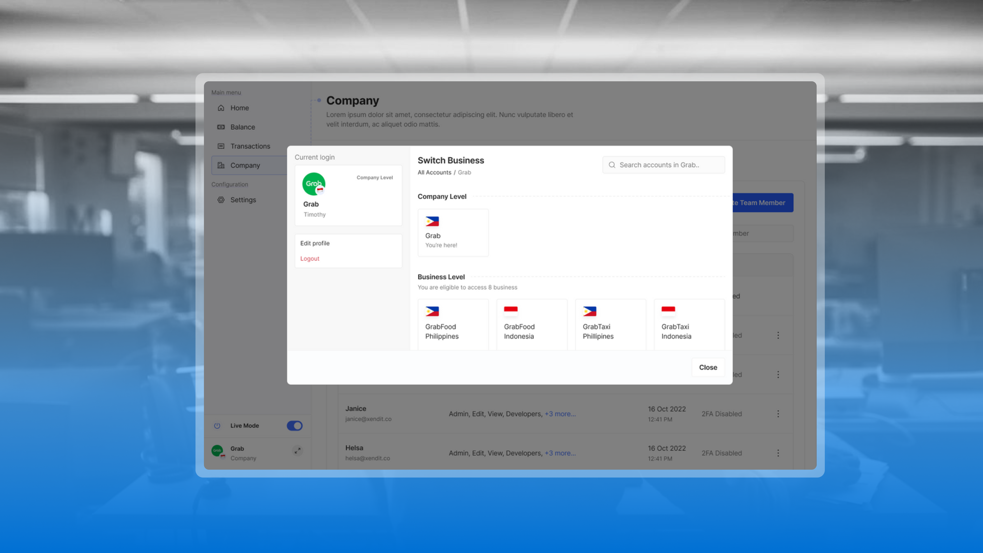
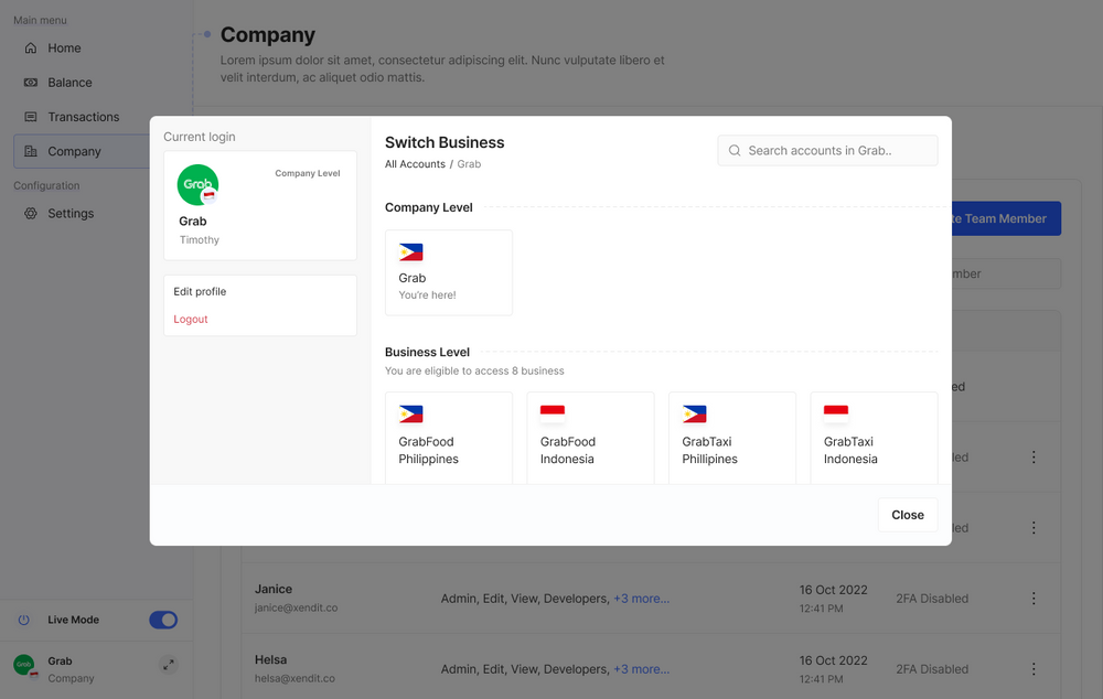
I led design research for Xendit’s multi-account experience, a new parent dashboard that helped enterprise clients manage multiple business accounts in one place. Designed for larger customers operating across entities, business lines, and markets, the work reduced operational fragmentation and gave finance teams a clearer view across the business.
Key Result
Churn Risk
Deliverables
Problem Space
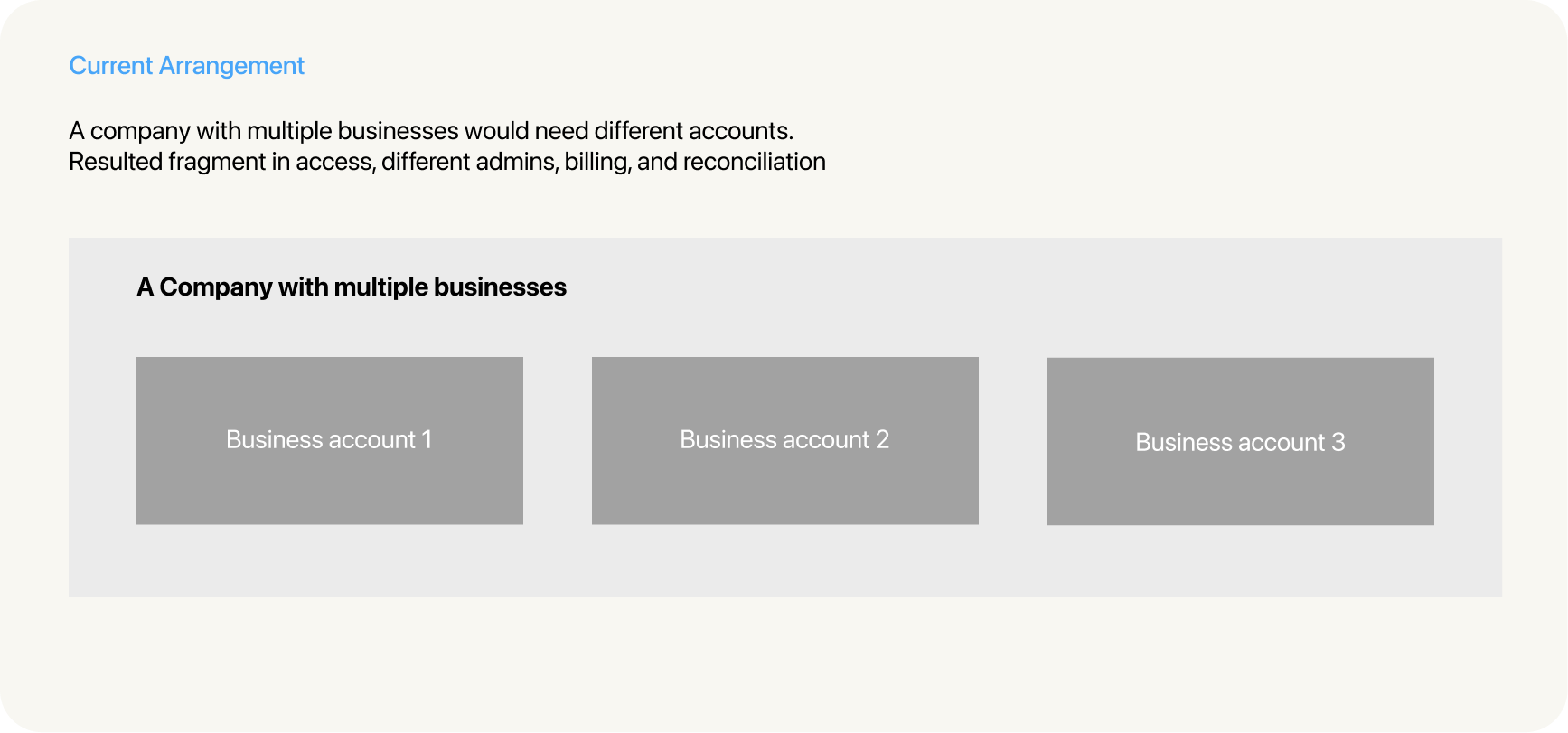
Enterprise customers were managing 10+ Xendit accounts across legal entities, regions, and business lines. While necessary for compliance, it created significant operational complexity — and the dashboard wasn't built to support them.
Manual reconciliation
Finance teams manually reconcile activity across multiple accounts, tools, and systems
Diverse account ownership models
Super admin ownership varies by team (product, finance, or tech) with no standardised model across the organisation.
Fragmented workflows
The lack of a unified system leads to siloed processes across teams, making collaboration and handoffs difficult.
Duplicated work
Without a single source of truth, teams end up repeating the same tasks across different tools and systems.
Limited visibility
There is no centralised view of activity across the organisation, making it hard to track, audit, or report on account activity holistically.
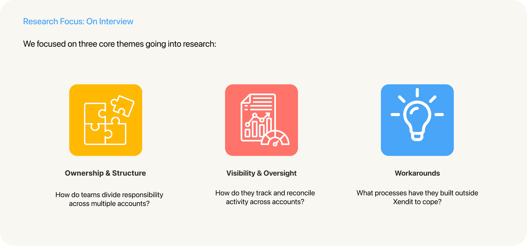
User Research

I led research to understand how current larger organisations structured account ownership, financial oversight, and access control across teams.
The findings pointed towards our early assumption about account ownership, financial oversight, and access control meant something different to every team depending on how their business was structured.
Analysis
Key Insights
Reconciliation is the core job
Merchants use the dashboard mainly to match transactions against internal records — data accuracy matters more than in-dashboard analytics.
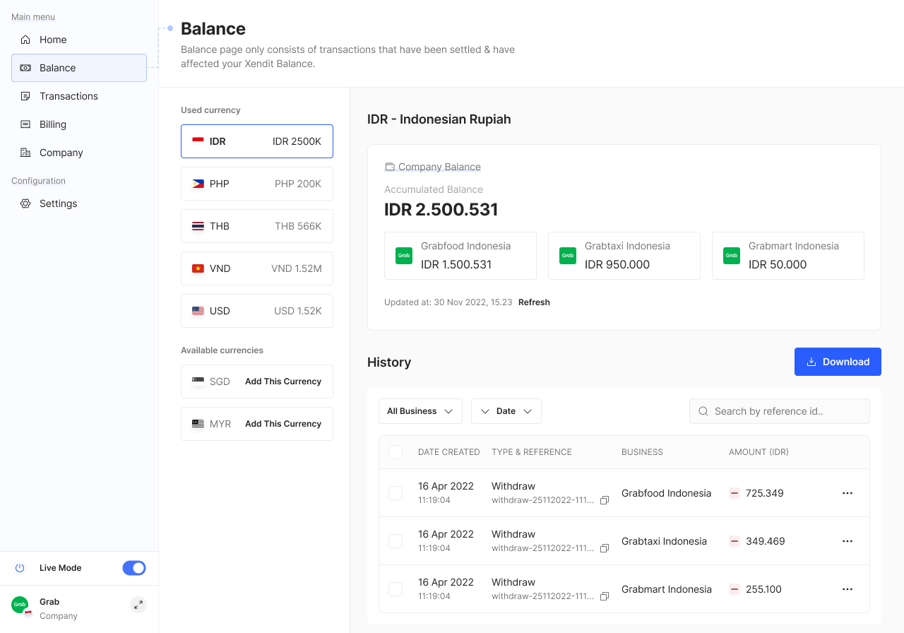
One view, separate balances
Merchants want all accounts visible in one place, but balances must stay separate — each account is owned by a different team.
Permissions should match how people work
Access based on job functions — not roles — was a recurring ask, alongside preventing admins from modifying their own access.
Based on the concept testing, we broke down each experiments we did with the concept and captured all the findings based on user feedback.

As reconciliation was the most critical task, the balance page drew the most attention during concept testing, so we prepared two balance page designs to test.
Research found participants valued both formats for different reasons, but most leaned toward the list view for its per-account breakdown, finding it more practical day-to-day. The graph view was seen as useful for a quick overview, but not urgently needed.
From this, we redesigned the balance page with a toggle, letting users switch between list and graph views depending on their needs.
UI/UX Design
Fintech/B2B SAAS
Design Strategist
Timothy Sianipar (Product Designer)
Ralph Gregor Aquino(Senior Product Engineer)