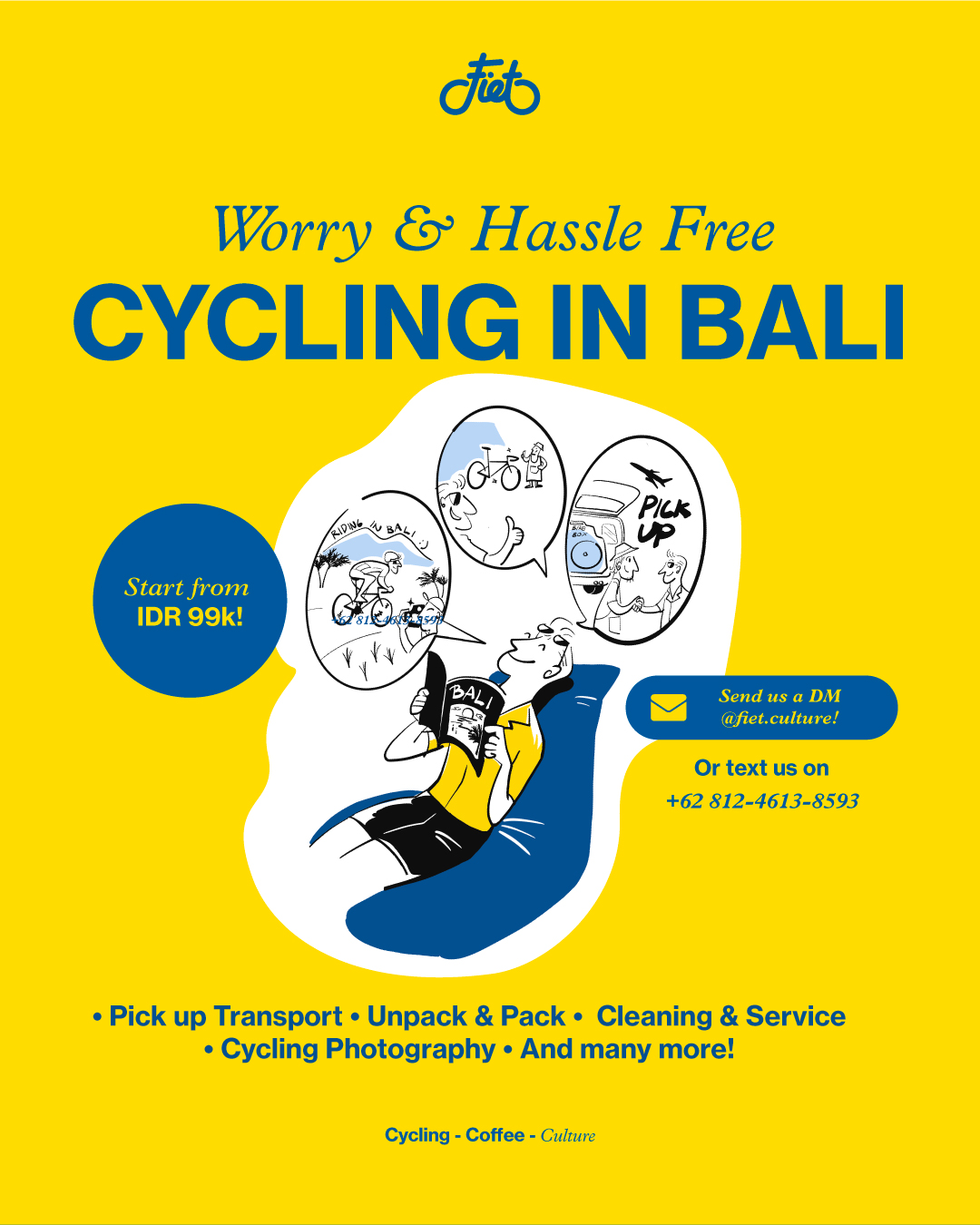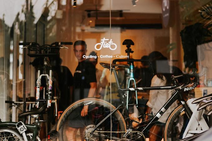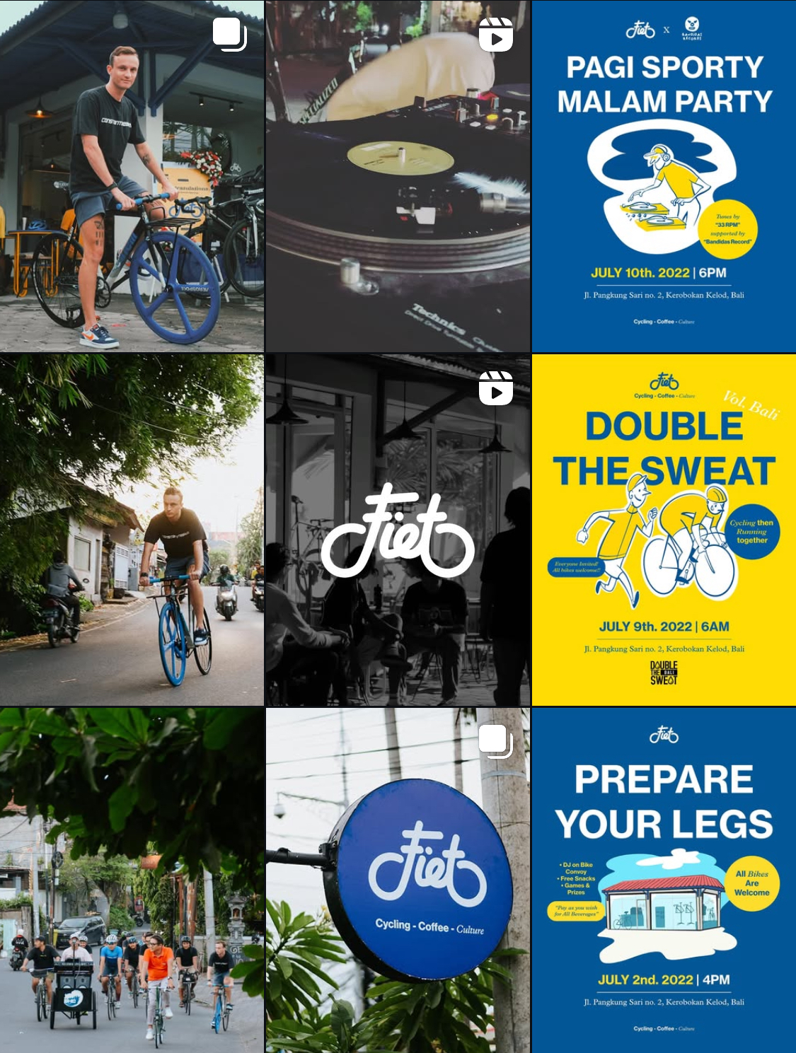
Located in Bali, Fiet is a cafe and bike shop I co-founded with other three friends. We offer services rooted in the renowned generosity and hospitality of Balinese people, which draws many people from all over the world to visit and stay in Bali. We aim to make the shop to be friendly and avoiding intimidation and exclusive feeling.
I joined the team bringing expertise in design research, product development, and commercialisation gained from previous tech startup experience. My role centres on branding and communication design.
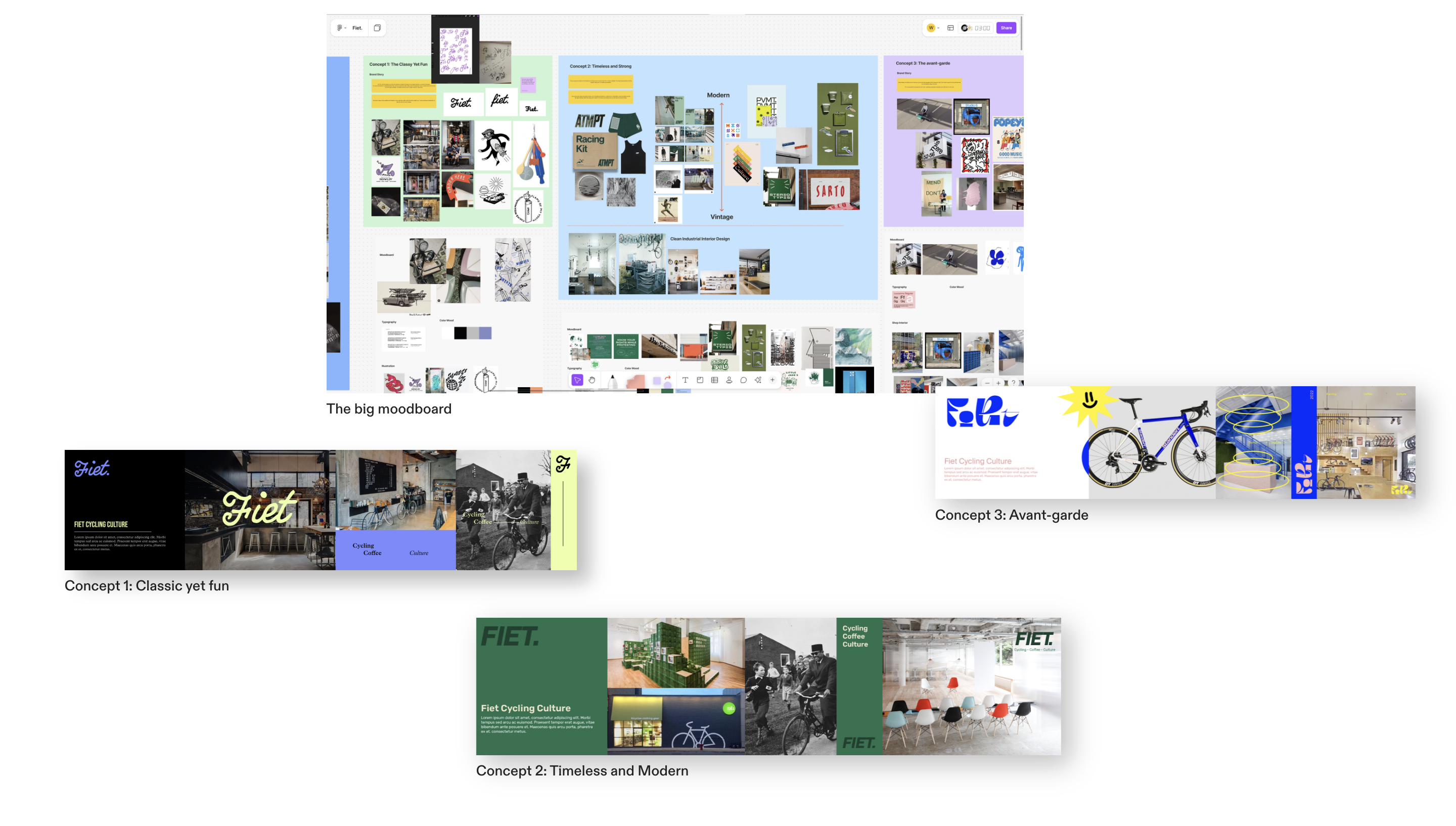
We came up with three directions for our initial proposal by making mockups that show the visual energy for the graphic and interior. We are using these mockups to show them to the team and get some feedback.
The feedback turned out that the team liking every bits of the concepts, which mainly put more weight on the concept 1 and 2, for the narrative but wanted to keep the bright color like on the concept 3. We then decide to come up with somehting new explorations based on the feedback.
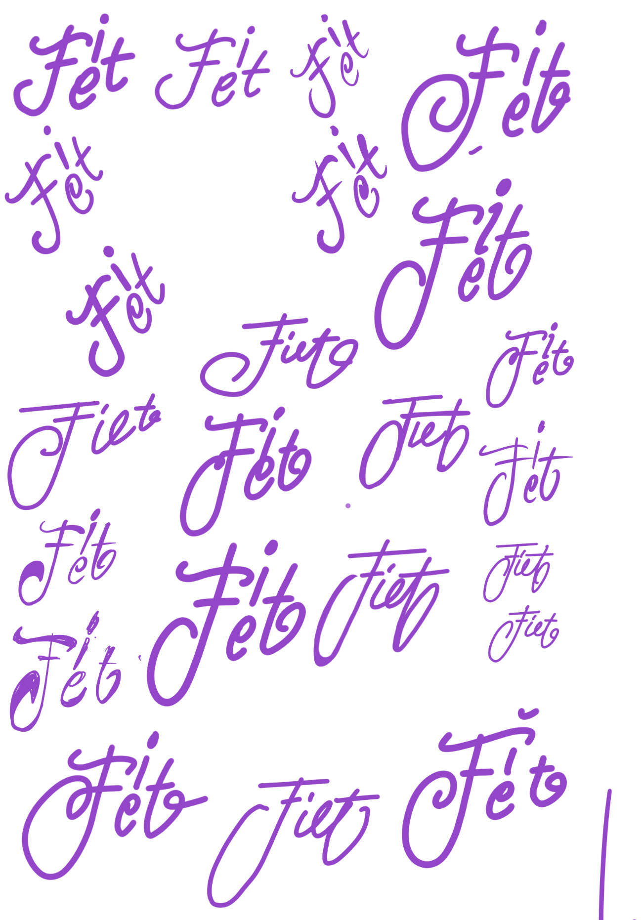
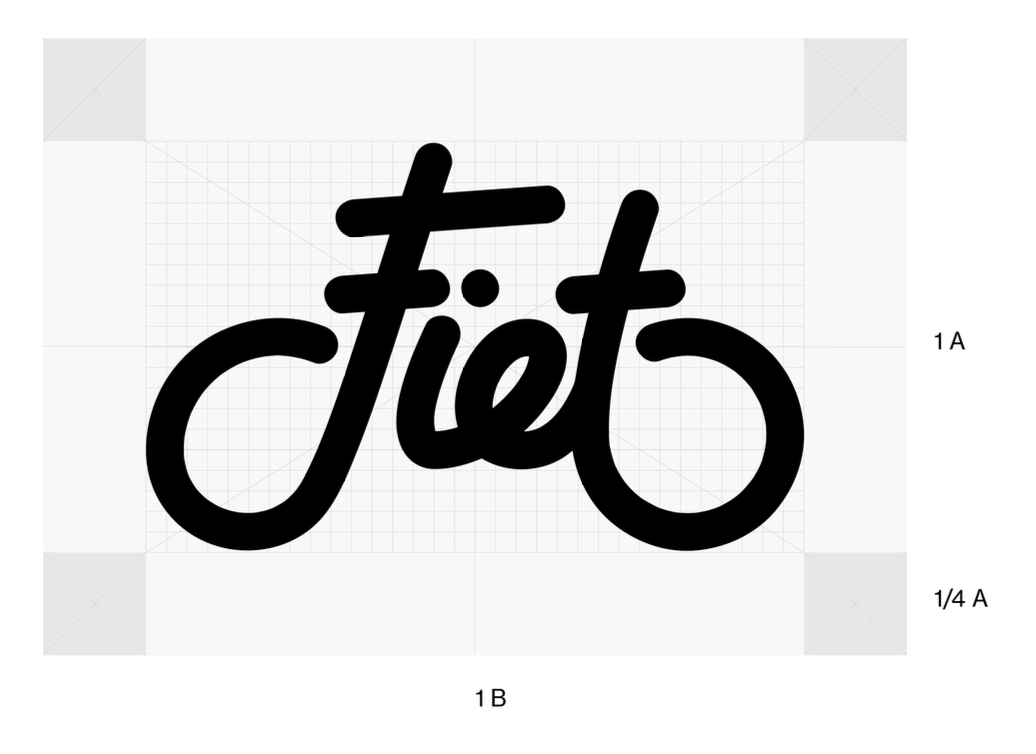
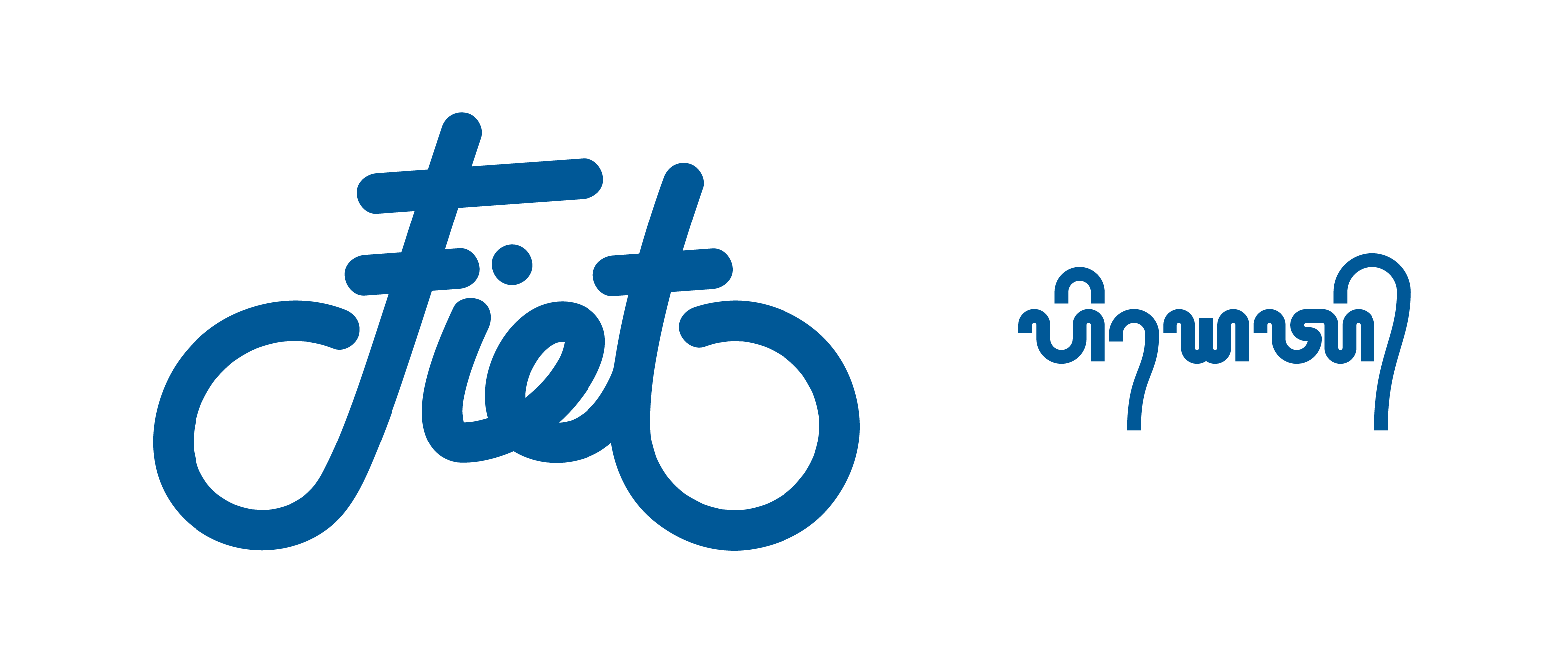
For the logo itself, we wanted to have the handwriting style logotype presented in concept 1, thus we explored different styles of handwriting and it came to my head that the word itself, if it's handwritten, can be shaped to look like a bike.